Monday, September 30, 2013
How to Ask For (and Use) Client Design References
A very smart business woman, who was also a client, told me once that the best time to ask for a reference or referral is in the middle of a project, or business deal, while the client is still happy with the process and before anything major can go wrong. And, as we all know, something always goes wrong.
For some of us, asking for references is easy and yet for others it's a terrifying prospect. It's important to keep in mind that your current client may have checked out your references before hiring you and they probably won’t be surprised to be asked to provide one as long as they are happy with the job you're doing.
Click to read on...
If you're looking for help making your home beautiful, contact me to learn about the possibilities.
Window Treatment Mistakes Even Experienced Designers Make – And How to Avoid Them
![]() |
Linda Merrill Decorative Surroundings | Photo ©Michael J. Lee |
![]() |
Window treatments and cushions made by Sarah O'Neil, Storibook Designs for Linda Merrill Decorative Surroundings |
![]() | |
Client rendering of window treatment design by Linda Merrill Decorative Surroundings |
If you're looking to make your home beautiful, contact me to learn about the possibilities.
Friday, September 27, 2013
Take a Fresh Look
Shaker Barn that houses the classic car collection at Heritage Museums & Gardens in Sandwich, MA - photo via
As designers, especially those of us involved in social media, we are inundated with visual images all day, every day. Sometimes, I feel like there is nothing I haven't seen already, read already, or done already. Burnout can hit anyone in any career. No matter how much we love it any one of us can get to a point where we stop "seeing" what's in front of us, or coming up with fresh new ideas. More than any other design medium, interior design is one for all the senses and so it makes sense to me that when we’re in need of a recharge and fresh inspiration, we engage all our senses in the process.
Lily pond - photo via
Museums: When asked, most designers respond that travel is their number one valued method of gaining design inspiration. This is certainly true - a trip to Paris or Tahiti will certainly do the job and travel of any kind can't be overlooked when developing a broad design sensibility. But when time and budget gets in the way of big travel plans, try a "staycation" and play tourist in your own town or region. Museums of all kinds offer great ideas and stimulating new experiences.
Historical house museums and art museums are obvious choices, but don't forget science museums which can boast wonderful modern architecture, or an aquarium which showcases natural beauty along with interesting exhibits and lighting displays. Single genre museums (automobiles, airplanes, dolls) are often housed in interesting buildings that may be historic or modern. Inspiration can come from anywhere and learning about historical design styles and their color combinations, or geometric patterns that speak to a specific time period can become wonderful inspirations for our modern designs. In the end, just being steeped in the creative genius of others is inspiring in and of itself.
Antique Carousel - photo via
The Flume- photo via
All images taken at Heritage Museums & Gardens, Sandwich, MA
Book reviews will continue next week. Meanwhile, have a nice weekend!
Thursday, September 26, 2013
Book Review: Martyn Thompson's WORKING SPACE
Working Space: An Insight into the Creative Heart
Martyn Thompson, who hails from Australia with stop-overs in Paris and London, has been in the States for 14 years. His photography has been seen in Arch Digest, W, The New York Times and Vogue. His clients have included Hermes, MAC Cosmetics, Ralph Lauren, Tiffany & Co. among others. His lens has captured the true nature of a working environment, clutter and computer cords and all. Work is work, it's not always pretty. We on blogs, and in shelter publications, often showcase beautiful and organized work spaces. But, as Albert Einstein famously asked "If a cluttered desk is a sign of a cluttered mind, of what, then, is an empty desk a sign?" Probably not a creative or productive one. (says the girl with the perpetually cluttered office...)
But having said that, I'm going to start with photos of the most beautiful (and tidy) working space in the book.
Killer, right? This is the Paris apartment/home office of Capucine Geagea an editor who launched her online magazine Plume Voyage from this room. Le sigh... The French just know how to mix modern with classic, minimal with maximal.
And another amazing space - less fancy but no less dreamy in its way - the work space of The Gaabs, a creative consultancy run by husband Marcus, a photographer, and wife Christiane, an art director.
I'd kill for a decent place to store all my books!
Wednesday, September 25, 2013
Book Review: Candice Olson FAVORITE DESIGN CHALLENGES
Candice Olson Favorite Design Challenges
(Houghton Mifflin Harcourt, 2013).
Fans of HGTV's Divine Design will love this 200+ page book featuring 24 projects that faced particularly difficult challenges of space, multi-use needs and more.
Each project includes "before" photos, a materials board, Candice's had renderings and beautiful large "after" photos, along with Candice's signature upbeat personality.
Here's an example of a project Before:
And After:
Tuesday, September 24, 2013
Book Review: HEIRLOOM MODERN by Hollister Hovey, photos by Porter Hovey
I'm very lucky to be on the press list for some of our favorite publishers of shelter books, but sometimes I get a little backlogged in my reading and reviewing. So, welcome to Book Week on ::Surroundings::!
photo via Hollister Hovey
Heirloom Modern: Homes filled with objects bought, bequeathed, beloved, and worth handing down
written by Hollister Hovey, photography by Porter Hovey, Rizzoli, New York, 2013
Long-time blog-celebs/sisters Hollister and Porter Hovey published their first book earlier this year. The Hovey sisters are well-known for their quirky "antiquarian" style (including a feature The New Antiquarians in The New York Times). While much of their postings are a little dark and foreboding for my tastes (just cannot with the taxidermy!), HEIRLOOM MODERN hits the right tone of mixing the old with the new, honoring and savoring the past while living in the present.
Photo by Porter Hovey, via Rizzoli
What I do love about this book is the honor they pay to their late mother, Lana, and how incorporating many of her prized possessions (such as the Hermes scarf pictured above) into their own home (a shared apartment in Williamsburg, Brooklyn) keeps her with them at all times.
I share this view as well and have many items that belonged to generations of family members. The trick, in design, is to showcase it without letting it all take over. This book features an eclectic mix of homes and is sure to inspire anyone who's tastes run to the traditional, lived in and well-loved.
Book Review: Love Where You Live: At Home in the Country
Love Where You Live: At Home in the Country
"I've learned that the best homes - the ones that are beautiful comfortable and that weather the years - are those that truly reflect their owners' passions" - Joan Osofsky
This is definitely NOT a book about "K"ountry style. Joan Osofsky is the owner of Hammertown Barn, the popular lifestyle stores located in New York and western Massachusetts. The book features eighteen homes that embody a relaxed, country lifestyle filled with antiques, flea-market finds and off beat elements.
The photography by John Gruen is beautiful and really captures the essence of chic, country living.
Images copyright John Gruen, used with permission.
Monday, September 23, 2013
Medallion Rug Gallery
Medallion Rug Gallery - New Contemporary Sultanbad Rug, hand knotted area rug, total knot count 1.65Million
Buying area rugs can be one of the hardest investments to make for many of us. A decent rug - which should be hand knotted for the best quality - is not inexpensive. However, a good quality rug can last decades even with a lot of wear and tear. My mother has a rug in her dining room that is at least 75 years old (it was from my grandparent's house) and it shows little wear even though it gets daily use. A beautiful carpet is a functional work of art and truly sets the stage for a finished room.
I was excited when Medallion Rug Gallery in Palo Alto, CA contacted me and offered me a rug to test out their services and see the quality of their products. Making a large purchase online can be daunting, particularly when color is so important to the look. After doing a little reconnaissance (I checked online reviews on Yelp, etc, to make sure they are a decent company to work with) I accepted their offer. Since it's understood that I'd be writing a post about my experience, I didn't want to be in a position of being polite because they sent me a rug, or being negative (my policy is to rarely go negative here on the blog). Anyway, I was happy with the general tone of their reviews, so after searching through their literally thousands and thousands of rugs online, I settled on this pretty Sultanbad style rug with pinks and greens on a cream ground. Pretty much my favorite color combination. The rug arrived very quickly (they offer free shipping - in both directions) - all 67 pounds of it! It was very well wrapped. The rug was actually a bit darker than I expected (the colors are spot on, just darker) - which is a good lesson to learn. Product photography is usually very well lit and many products look lighter than they may appear in real life. For my purposes, I was okay with it being a bit darker, but I asked the folks at Medallion about how they handle situations like this. For instance, I asked if they send additional photography upon request - which they will do. A digital photo from the showroom or warehouse (vs. professionally lit and shot image) would have probably shown it was darker. If the rug had not been acceptable, they will pay to have it shipped back and a new selection can be made.
My plan is to use the rug in my bedroom with my green painted four-poster, but for varying reasons, I can't get the room re-arranged at the moment to get the rug in. So, for now, I've put it in the living room until I can move it to the bedroom. You can see in the montage how pretty the rug is. I love the pattern and in a brighter room (this is north facing and always dark while my bedroom is always bright (even with mid-toned green walls). Hoping to get that move made soon and will repost when that happens!
Meanwhile, I decided to add some of Medallion Rug Gallery's products into my digital Dream House. I put my Sultanbad green and pink rug into my design studio/home office and think it works really well. I'm still working on the actual design of the home office, which is in the back of the house, but this is essentially the layout. There is a separate entrance leading right into this room from the side of the house. I would be able to meet with client's here, show them plans, etc. The walls would be used as pin boards. The sliding doors on the right would be pocket doors and have either etched glass or mirrored windows so the room could be a real working space without being visible to the formal library. My thinking is that the adjoining library/dining room will act as additional meeting space as needed and also house all my books and materials. (BTW - a big thanks to Yvonne Blacker who shot the photo of a Kravet Fabric's pin board and posted it to her blog Design Vignettes. I was able to "lift" the image for the board on the left side of this image)
New Contemporary Persian Tabriz handknotted rug, 6.3Million knots
Persian Tabriz area rug, handknotted, 1.65M knots
I selected another Persian Tabriz rug for the front sitting room that is open to the library. I love how the two rugs go together!
Thank you to Medallion Rug Gallery for offering an area rug for review and for answering all my questions about your services.
Wednesday, September 18, 2013
Real Estate: A Colonial Surprise
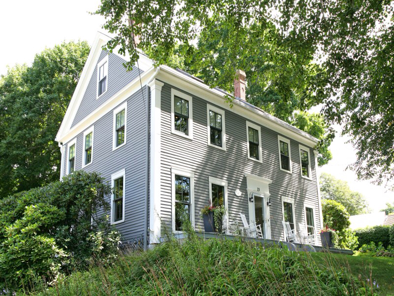
Sometimes, you just get a feeling about how a house will look on the inside. This colonial style house (built in 1860) is located in the historic district in Sandwich, MA on Cape Cod. I've been by it a million times since my parents moved to town in the 1980's. It's on a fantastic lot, sitting on a hill overlooking the beautiful Shawme Pond. I've loved the simple detail and the neat little porch out front with the classic white rocking chairs. It seems so homey. But yet, I had the feeling that this simple exterior was hiding a secret.
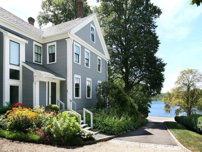
For instance, there is an unusual "gazebo" structure out back - not a typical style for the area. But because of the way the property is set back and higher than the road, it's impossible to see what's going on back there.

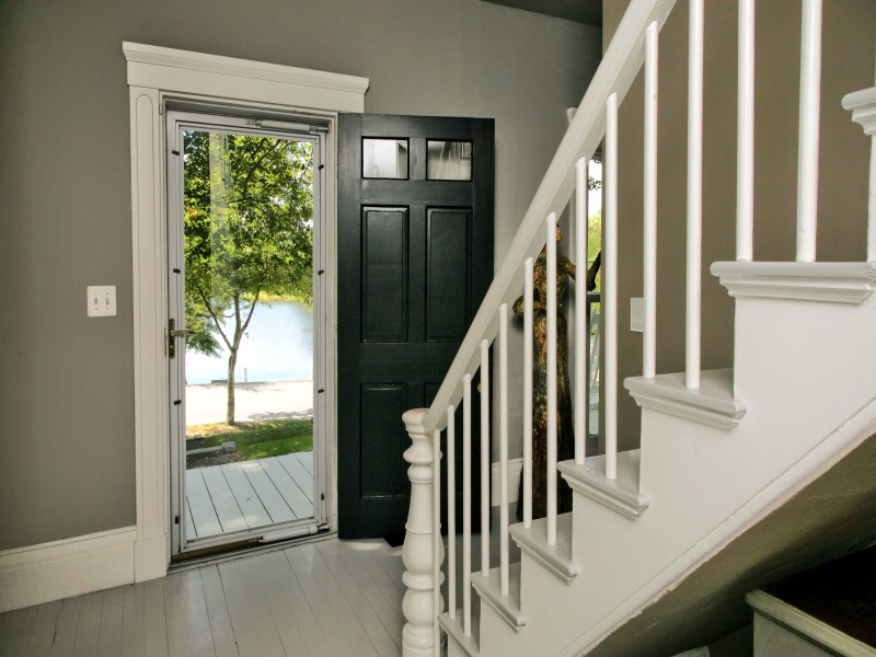
So, I was excited when the "For Sale" sign went up a couple of weeks ago - knowing I'd finally get to see what's happening on the inside. Being of the colonial style, built in the mid-19th century, the house is clearly a center entrance, four over four "box". Staircase running from the front door on up. There's nothing remarkable about this front entrance hall - other than it's clean simplicity - all in white and gray. Most houses in this town, of this era, are pretty heavy and dark.
And... pow! The image below is taken from the rear of the first floor - dining room area - looking back to the front hall and door. They've removed the walls (leaving only those necessary to hold the second floor up) and made a modern, open floor plan within the colonial envelope. It's pretty fabulous. I particularly love the shiny painted floors. The house has approx. 3,400 sq. ft - though that includes an addition out back. The original house was likely about 2,000-2,500 I guess.
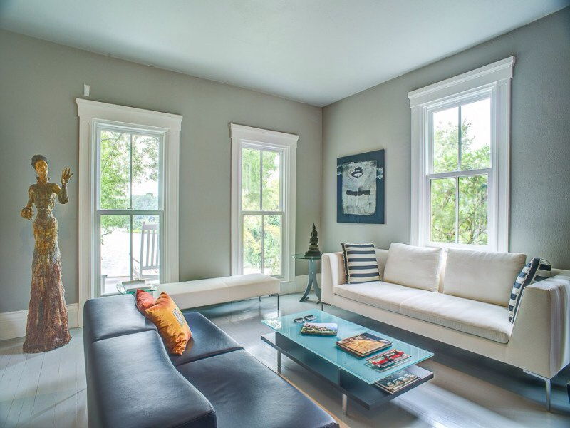
The red wall block conveniently helps us figure out the floorplan. The sitting room below with the white sofa is on the left side of the front door, as you're facing the house. The fireplace has what looks like an original gas insert - looks very common in late 19th century Victorian style houses. So, possibly there was originally a wood burning fireplace that was retrofitted with gas. I like the original touch - though a more modern gas firebox wouldn't have been out of place given the other changes made.
Love, love the statue. Clearly, the owners are huge art buffs - their collection is amazing. I'm guessing the furniture is a lot of Roche Bobois. I love the big windows - which are a change to what was likely the original window sizes. Actually, I have to wonder how they got permission from the town to make some of these changes - this town can be strict! My dad wanted to paint his cute little back yard shed "barn red" and it was a fight - and they don't live in the historic district! And tv-man Tom Ellis famously tried to put double french doors on their antique house and they were rejected - even though that house can't be seen from the street. Perhaps this is why the house is so simple from the front...
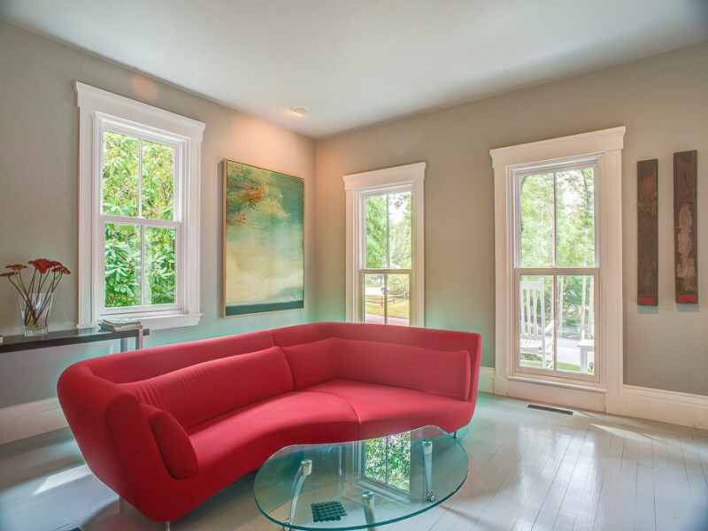
Anyway, back to the rear of the house, we're now looking from left to right (as facing the house). We have the red wall, the opening to the above sitting room, the opening to the front hall, and then the opening to the other sitting room, on the right side of the front door (as facing the house)

Very much an art gallery feel. Again we have the Victorian looking gas insert. I definately think they should have retrofitted a more modern insert - but perhaps there was a reason it couldn't happen. It is hard to imagine what actually happens in this room. I might have have made it the dining room rather than a 2nd sitting room. Or possibly a music room - something more specific.
Anyhow, the dining area is situated in the back portion of the original structure, where the original kitchen probably stood. Loving the black wall and the art. The far wall shows a picture gallery and old-timey writing desk, fronting what looks to be a lavatory. I'll admit I don't love the dining table and chairs at all - very hard and cold. I like the idea of the chandelier, but it's too high and just seems out of place.
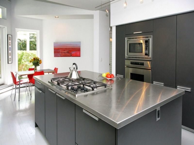
And, we come to the new addition which houses the kitchen, designed by Alan Clarke (now retired) of Poggenpohl in Boston.

Again, kind of a "pow" moment in the home. The little table and chairs is a bright spot with a great view of the back yard and garden.
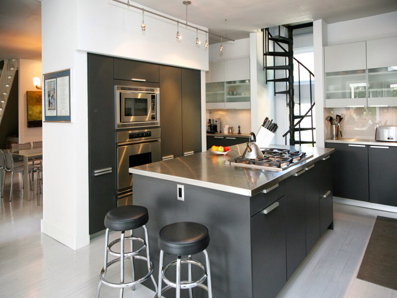
The tiny spiral staircase leads to a bedroom above, which overlooks the table and red chairs and has a view of the gardens.
And up the spiral staircase we have this very zen space. I think it must be the master - but then it's awfully exposed to the downstairs, so I'm not sure. The bed looks to be floating in the middle of the floor, with the wall of cabinets behind that acts as a visual backdrop. Certainly stunning.
This is the upstairs center hall, where they've added an unusual spiral staircase to the attic - I guess.
This is a home office, I'm guessing the wall with the single window is overlooking the driveway on the right side of the house and the window is on the front of the house. The shingle house outside the window looks like the house next door. The door to this room would be by that odd spiral staircase shown above.
This bedroom is on the left hand side of the house (as you're facing the house). Love the color - so pretty. Very much "in the trees" feeling.
This looks to be a daughter's bedroom in the rear of the house, behind the home office, overlooking the driveway.
The white vanity is sort of an old-fashioned moment in the otherwise very pristine space.
And now we get to some real changes - the rear of the house. I'm not sure when the different additions were put on - though I have to say that I'm personally too traditional to love how they handled this addition - it seems out of place. But it's the back and the landscaping is gorgeous.


The house at 15 Water Street in Sandwich, is listed at $990,000 via Sotheby's Cape Cod. I think it's a gorgeous property. I love that while they made the interiors super modern, it would be easy to walk that back a bit for those whose tastes are more traditional. The basic structure is untouched and while there are fewer walls the fact is that open floor plans are very popular today. The kitchen will likely be the biggest obstacle for many. On the one hand - it's a first rate, luxury kitchen with all the amenities. But its modern aesthetic will be a stumbling block for some. The exposed master bedroom (as I said, I'm assuming it's the master) is also problematic.
If I were hired to decorate this house for the next homeowners (hint, hint) I would probably put on a full glass wall in the master, instead of just the glass balcony, or possibly some kind of retractable wall. I'm not sure if the spiral stair case is the only way to get to that bedroom (lord, I hope not!) and assuming it's not, I'd eighty-six the spiral to gain more light and space.
What to do with the kitchen would be the tricky part... Well, all it takes is money. I'd want to soften the palette and add it some more natural materials. Possibly:
Or just rip it out and start over:
My take? If I could, I'd buy it in a heart beat. What do you think?