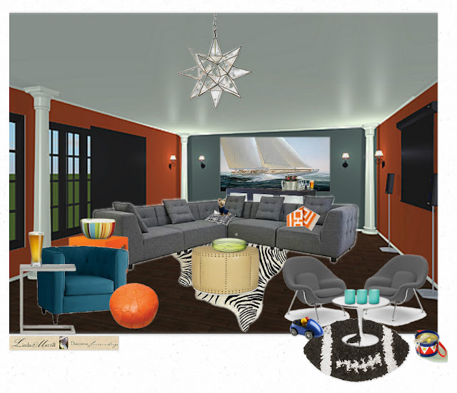
This is my entry below, which I've called "The Brady Boy's Man Cave", in honor of Tom Brady and the New England Patriot's
I thought I'd show a little of what I've learned this week. There have been references to 2D and 3D Boards. Of course, we all know the difference between 2D and 3D, however, when it came to Olioboard, I wasn't sure. I kept thinking there was some technology I wasn't aware of. In fact, it's simply this:
The above is basically a simple "board" with the elements you might use in a space laid out in 2D fashion. This is more the classic design presentation type board. And, it certainly illustrates the concepts for a design plan, or wish list, depending on how you're using it.
In Olioboard, there are many different ways of creating a design scheme. The 2D version above, or a more 3D version as shown directly below. As designers know, not all clients can "visualize" a space as we can. So, while a designer might look at the 2D board above and immediately know how it's all going to fit together, our client's may need a bit more help. But, there is no technological difference between the creation of these two boards, it's simply how they are laid out and the addition of a background to create context.
The image above was my "first draft" of a 3D man cave. All the same elements are included in the 2D version and my final version. This was done using only the items currently in the Olioboard libraries, which include flooring, wallpapers, lighting, etc. It's not bad, but still a little rough looking. It does tell more of a story, but I am bothered by the flat wall and floor onto which furnishings are layed in a room-like manner. Meanwhile, I was noticing some amazing boards that included perspective elements like receding horizons, hallways, windows outside, etc. Hmm.. I wanted to do that! One of the best parts of Olioboard is that you can upload your own images, and actually "pin" (cross reference, but oh well) items from the internet into your account - so you don't have to stick with the existing libraries. I haven't actually done that yet, but will try it at some point. I did, however, upload an image.
There are some room background images available on Olioboard, but I didn't love any of them. Meanwhile, I've been working on improving my skills at Live Interior 3D, which creates floor plans and 3D renderings, including lighting and shadows. So, instead of trolling the internet for a background I could use, I created my own design for Tom and the boy's man cave. Since I was using the large gray sectional in my design (see above), I did my best to orient the room angle to match the sofa, while still getting in the 3 walls. I laid in a dark stained floor, two dark orange walls and two gray walls. The ceiling is a glossy dove gray. I included sliding doors on the windows on the left to block out the sun when watching the tv on the right and I added the architectural columns because I suspect there are more than a few in Tom and Gisele's new California house...
I create a JPG image of the empty "room" and uploaded it to Olioboard onto which I laid all the furnishings and accessories.
For the final decorations in my Brady Boy's Man Cave - and yes, there's room for Gisele too - I have included big comfy teal tub chairs and orange pouf and side table. And there's even a play area for Tom's two sons complete with child size Knoll Womb chairs and Saarinen table. I wanted to create a comfortable space that has modern and traditional elements - a little New England stability mixed with California warmth, all topped with a star light fixture - because they are stars after all.
For me, the 2D and final 3D version with custom designed backgrounds are the best. The middle version in 3D isn't polished enough to be a good representation of a design concept, although I know from what I've seen on their site that some people get amazing results doing it this way.
So, if you're looking for yet another way to spend hours playing with digital design, check out Olioboard. There are many more features I didn't cover as I'm still learning myself. You can learn more in two different Blog Talk Radio recordings hosted by Leslie Carothers here.
Meanwhile, check out my board and all the amazing entries to the Olioboard Man Cave contest here.
If you would like my help on your design project, I would love to chat with you! Please email me. Thanks!


0 comments:
Post a Comment