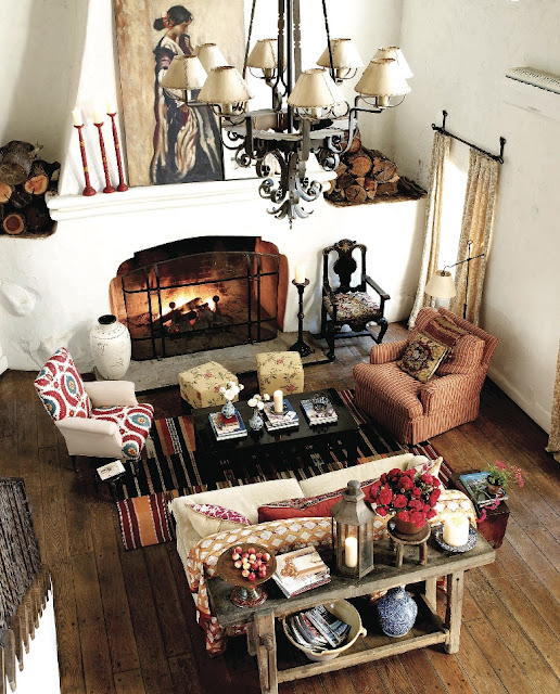
Before Reese, there was Kathryn Ireland, whose book Creating a Home profiled the history and her renovations of the house. Before Kathryn, actor/director Harold Ramis lived there, and starting it all was famed architect Wallace Neff, who built it in the first place as a barn in the 1920s. In the 1940's architect Austen Pierpoint converted it to a house.
It's really fascinating to see the changes this one property has undergone, and now we get to see how Miss Reese has made it her own. When we interviewed Kathryn on The Skirted Roundtable last year, she told us that Reese had purchased the house AND all its contents. Seems she and her decorator Kristen Buckingham have pretty much thrown it all out and started over since her purchase in 2008.
Let's play compare and contrast, that's always fun:
Starting in the Living Room, the Elle Decor/Reese Images (photographs by William Waldon) show a muted palette, rustic throughout. There is an eclectic mix of furnishings spanning different time periods with only the occasional punch of green in the plants and lamp bases which draw the eye towards the windows and the lush greenery in the exteriors.
Reese has created a small sitting area and table are in the back end of the living room - it's almost like a small library type space. Kathryn, as you'll see below, used this space for her formal dining room.
Contrasted with Kathryn's bold and lively mix of pattern and color:
Kathryn's dining area.
(note, the image above is unusually muted and based on the other images, not indicative of the actual color palette)
Reese's Dining Area continues the eclectic yet muted palette from the living room. I believe that Kathryn used this space off the kitchen for comfortable seating and had a smaller kitchen table in the kitchen as you can see below. The floors match. I wonder if they closed this off from the kitchen, somehow? The Elle Decor feature doesn't include the kitchen so it's hard to tell.
And above is Kathryn's light and bright kitchen with open upper shelves. From the chair in the foreground, you can see how open this sitting area is to the kitchen. But Reese's dining room seems too formal to be a part of this much more casual kitchen plan.
Reese's kids rooms have gotten a makeover as well. There is more use of color in these spaces than in the public rooms.
But they still don't come close to Kathryn's bold views:
And for fun, these are the real estate photos of the staged house prior to Reese's purchase. Interestingly, these are also very dull in color.
So, the question is: which do you prefer: Kathryn Ireland's bold style, or Reese's (and by Reese I mean designer Kristen Buchingham) more muted palette? Which do you think works best with the original architecture of the house? My personal opinion is that I am visually drawn to the updated space, but think I'd have been more comfortable hanging out in Kathryn's space, which feels more welcoming. In fact, both designs totally reflect their owners. Kathryn IS colorful, comfortable and a little sloppy while Reese is more reserved, cerebral and (by her own admission) very Type A.
What do you think?
Photos courtesy of: Elle Decor/William Waldon, House Beautiful/Scot Schy, Kathryn Ireland, The Realestalker, Vogue Living/Thibault Jeanson, Creating a Home by Kathryn Ireland.
If you would like my help on your design project, I would love to chat with you! Please email me. Thanks!


0 comments:
Post a Comment